In the second part of this four part series, I will look at how well hitter walk rate can be modeled by plate discipline. I highly recommend reading the first installment, as much of the methodology is the same. Due to this similarity, I will omit most of the methodology in this piece.
Methodology
I am working with the same data set and with the same features as last time. However, there are still several new points I want to mention.
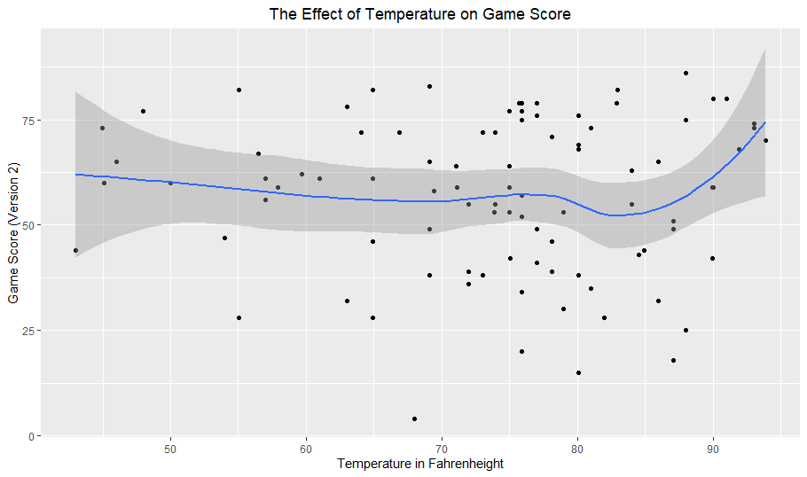
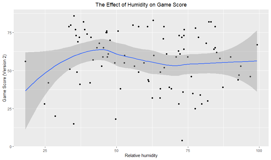
Before looking into the data, my intuition was that O-Swing would be the most influential feature. Out of all the features, O-Swing has the most obvious relationship to walk rate; swinging at a pitch outside of the strike zone will almost never be beneficial in taking a walk. Fouling off a borderline pitch in a two-strike count is a possible exception to this, but even in this situation a hitter seeking a walk is probably better off taking the pitch. I also thought Z-Swing would have a moderately negative effect on walk rate, as swinging at more pitches in the zone likely means shorter plate appearances (PAs) and fewer walks. I did not expect the two contact statistics to be very helpful but thought they could low contact rates could possibly be linked to higher walk rates because more contact usually means shorter PAs. Zone and F-Strike are fairly simple, as high values in either mean less balls and thus fewer walks.
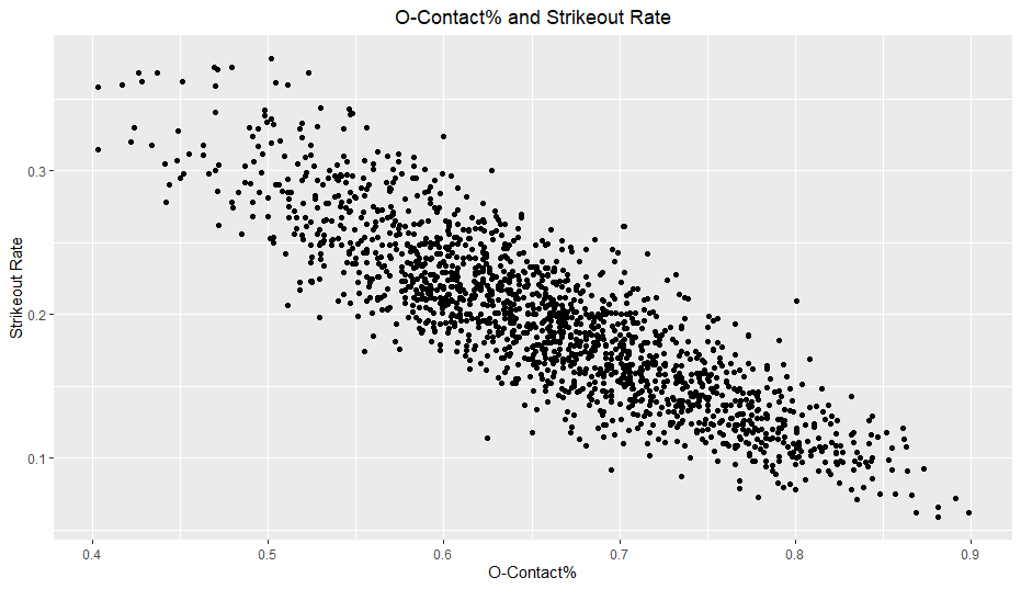
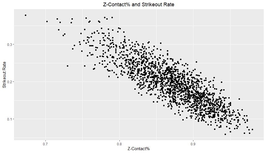
Looking at the marginal correlations between each statistic and walk rate, the results aligned up pretty well with my intuition. O-Swing had the highest correlation easily with -0.708, followed by F-Strike at -0.575. All of the other correlations were also negative and around -0.20. I did not expect F-Strike’s relationship to walk rate to be the second highest after O-Swing, which means I once again underestimated F-Strike’s importance. I also expected Z-Swing’s correlation to be higher.
The individual O-Swing and F-Strike versus walk rate plots reveal some interesting findings:
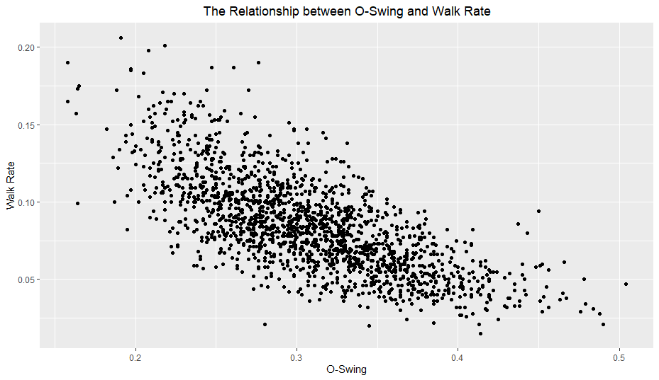
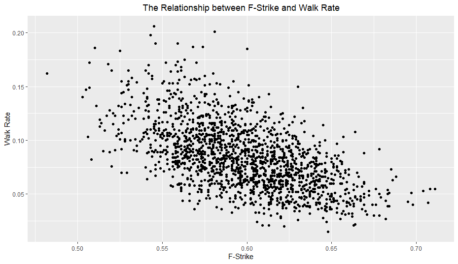
Both O-Swing and F-Strike appear to have a somewhat non-linear relationship with walk rate. I planned on looking at polynomial terms for all variables anyway, but I will especially keep an eye on these two variables.
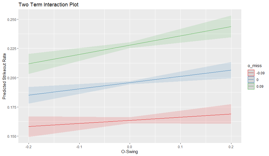
I will test all of the same interaction terms as last time with one difference; I will use O-Contact instead of O-Miss. For strikeout rate, O-Swing and O-Miss work in the same direction (high values of both together should lead to high strikeout rates) but for walk rate, high values of O-Swing and O-Contact together should lead to lower walk rates (high swings at balls + high contact = lower walk rate). Thus, I will simply replace O-Miss for O-Contact for this article.
For this analysis, my regression methods of choice were standard multiple linear regression, ridge regression, and several regression tree techniques including bagging, random forests, and boosting. I decided against using lasso because I am already testing which variables meaningfully improve standard multiple regression (in terms of cross validation mean squared error), so using lasso would be somewhat redundant.
Results
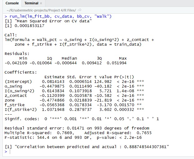
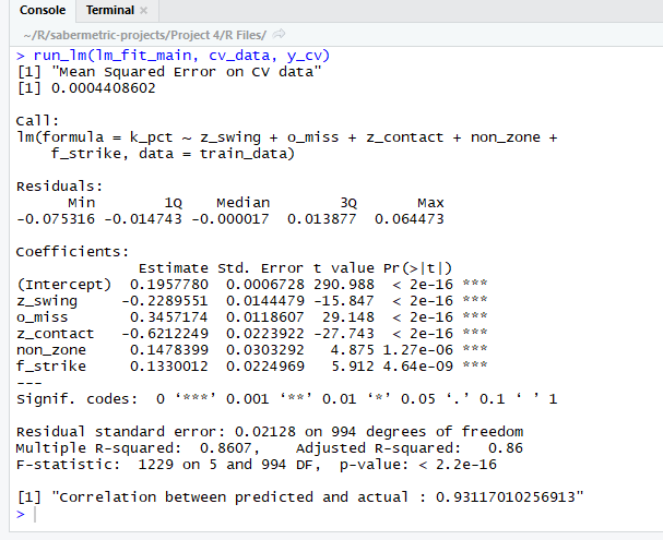
There were several tough decisions I made when selecting my final model. While the O-Swing ^ 2 term is significant (p-value of 1.4e-8 in the above output), it only slightly reduced the CV MSE (cross validation mean squared error). Even though the drop in error was slight (about one percent), it was enough for me to include it in the final model due to very small p-value and graphical evidence. However, I can definitely understand omitting it for model interpretability’s sake. On the other hand, the F-Strike ^ 2 was not nearly as significant in terms of p-value, yet it caused a sizable drop to the CV MSE, making it an easy choice to include. I also ran an ANOVA test comparing this model to the same model without the polynomial terms and found a very small p-value (less than 1e-9), providing more evidence for the polynomial terms.
Another choice I made was omitting the O-Swing * O-Contact and Z-Swing * Z-Contact interaction terms, despite the fact that they had significant p-values. I chose to do this because one, the p-values were not extremely low (around 0.01) and two, neither term helped the CV MSE meaningfully.
Somewhat surprisingly, both Z-Swing and O-Contact did not individually add anything to the regression and in fact increased the CV MSE when added. This was another reason I omitted the interaction terms; typically, when you include interaction terms, you also include the main effects. In this case, including the main effects actually hurt the model’s performance on the CV set.
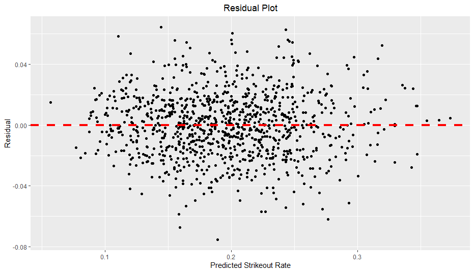
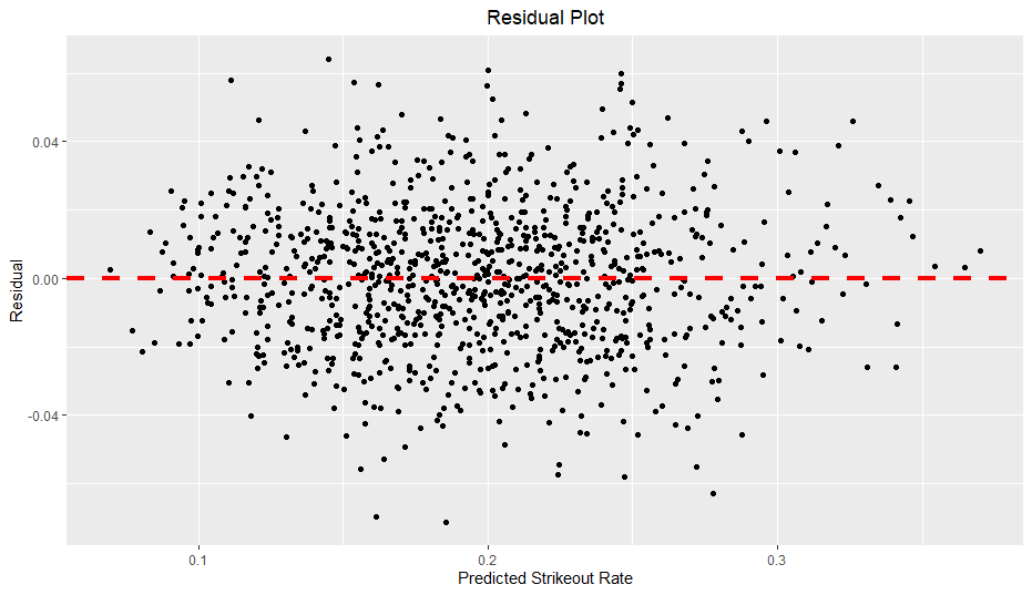
One problem with this model, however, is heteroscedasticity.
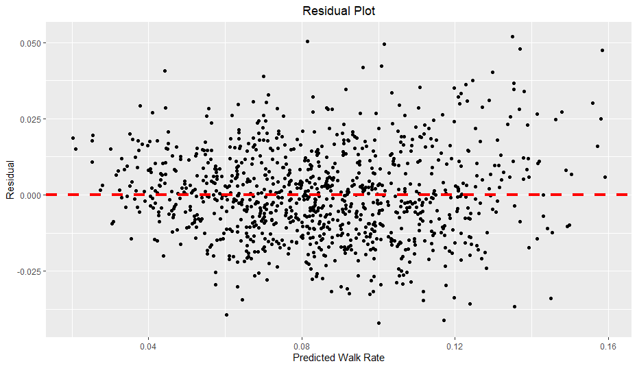
As you can see, as predicted walk rate increases, the residual range seems to expand slightly, creating a slight funnel shape. Of particular note, when the predicted walk rate is over 0.12, the residuals seem to increase in magnitude, especially in regards to positive residuals. In other words, the model seems to underestimate walk rates when the prediction is above 0.12 and generalizes poorly on more extreme walk rates. I also verified the presence of heteroscedasticity with the Breusch-Pagan test, which also found strong evidence of heteroscedasticity. When there is heteroscedasticity in linear regression, the standard errors can be significantly off, so I also found robust standard errors using the sandwich and lmtest packages (similar to here).
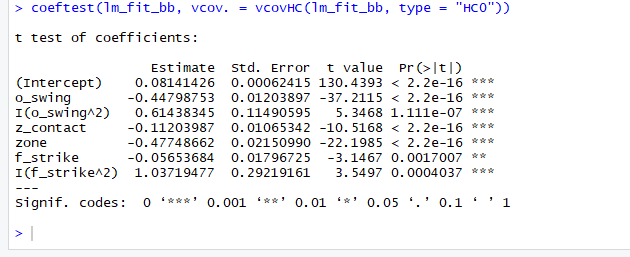
Fortunately in this case, all of the terms are still significant and the standard errors were not too far off.
The overall formula is:
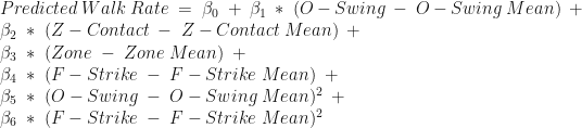
with the below values:
| Variable Name | Training Data Mean | Coefficient Name | Coefficient Value (Rounded from R output) |
| Intercept | NA |  | 0.0814 |
| O-Swing | 0.3087 |  | -0.4480 |
| Z-Contact | 0.8702 |  | -0.1120 |
| Zone | 0.4339 |  | -0.4775 |
| F-Strike | 0.5986 |  | -0.0565 |
| O-Swing^2 | NA |  | 0.6144 |
| F-Strike^2 | NA |  | 1.0372 |
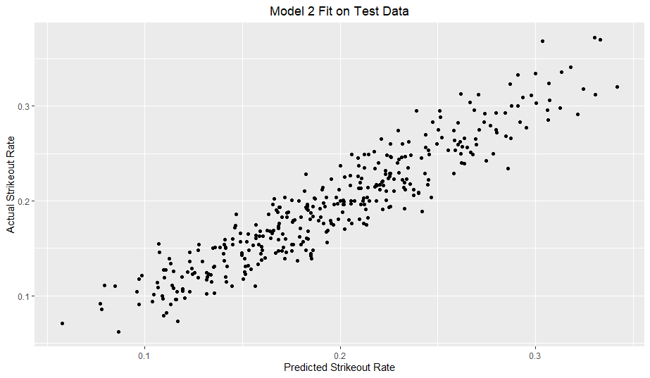
Here is the model fit on the test data:
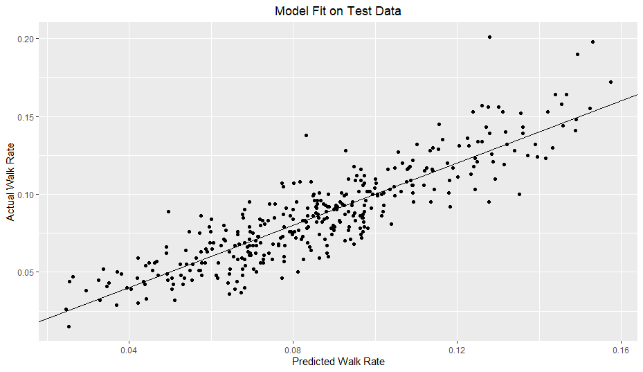
I added a reference line with a slope of 1 and y-intercept of 0. With a good model fit, the data should hug the line somewhat tightly. For reference, I included a model solely based on O-Swing and Model 2 from my previous article.
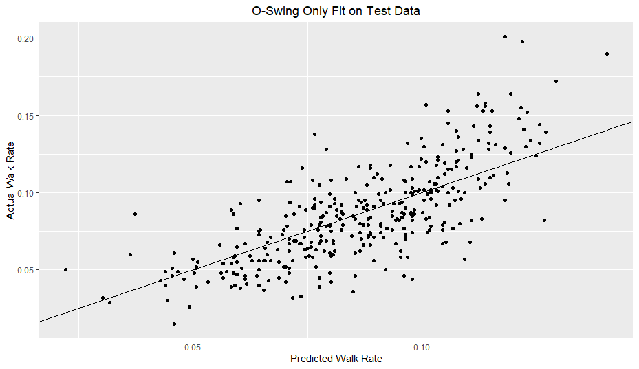
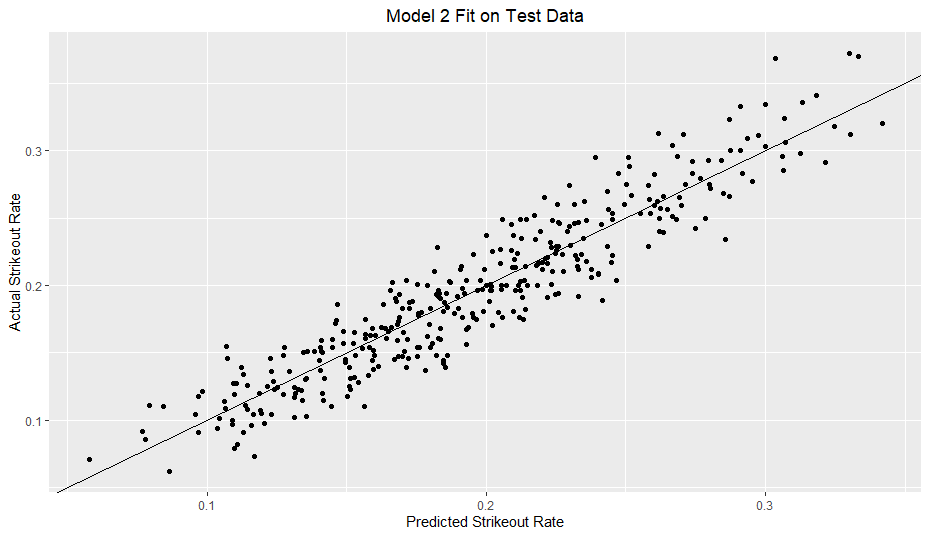
My model clearly outperforms the O-Swing only model. However, in comparison to my previous strikeout rate model, my walk rate model definitely does not hug the line nearly as well.
I thought that ridge regression could combat possible overfitting due to the polynomial terms but like last time, ridge regression did not help my model. Additionally, none of the regression tree models outperformed multiple regression. However, I will include a graph displaying variable importance for a random forest model I tested:
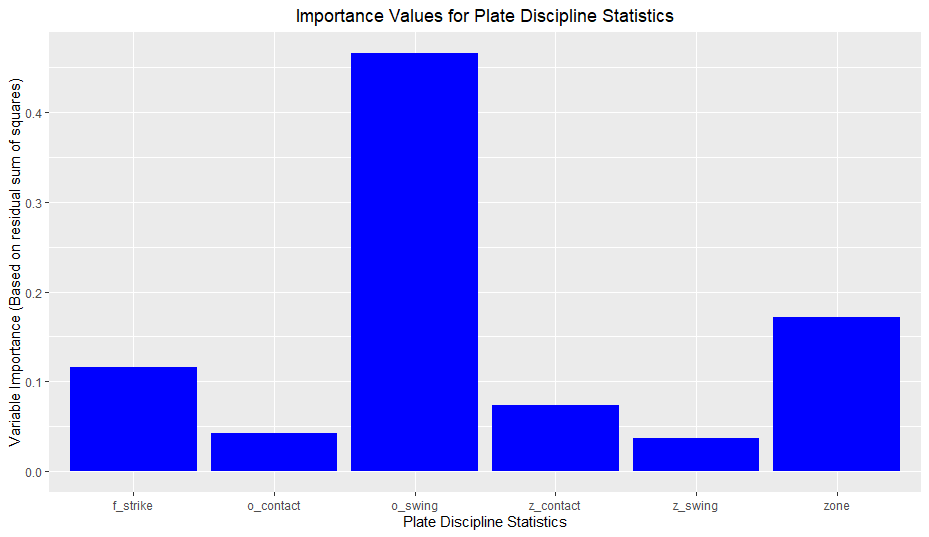
The graph aligns with my results from multiple regression; O-Swing is extremely important, whereas O-Contact and Z-Swing are minimally useful.
Conclusions
- High F-Strike and Zone values are linked to lower walk rates
- My model easily outperforms an O-Swing only model
- There was mixed/weak evidence for interaction terms
- O-Swing is the best and most important predictor of walk rate easily (among the plate discipline metrics I looked at)
My intuition on this was correct; O-Swing ended up being easily the most influential variable in my variable set. To reiterate, I reasoned that O-Swing was the only statistic that, in my opinion, had an obvious relationship with walk rate (swinging at balls is virtually always bad for taking walks).
- There is strong evidence for Z-Contact being linked to walk rates and much weaker evidence for Z-Swing and O-Contact
This is a complicated one; I don’t have a surefire answer why Z-Swing and O-Contact had less value relative to Z-Contact. However, I do have some ideas. In 2019, the league-wide values of O-Swing, Z-Swing, and Zone Percentage were 31.6%, 68.5%, and 41.8% respectively. Using basic dimensional analysis, I found that the percentage of total pitches that were both out of the zone AND swung at was roughly 18% whereas the percentage of total pitches that were in the zone AND swung at was about 29%. In other words, Z-Contact involves a greater number of pitches than O-Contact (29% vs 18%), perhaps leading it to influence walk rate to a greater degree.
In terms of the direction of the effect on walk rate, despite having a negative marginal correlation to walk rate, O-Contact actually had a positive coefficient (high values of O-Contact increase predicted value of walk rate) in a model with all of the main effects. I would expect more contact to generally lead to fewer walks, but in a case like fouling off a ball rather than missing it in a two strike count, making contact can help extend plate appearances and increase the probability of a walk. While the coefficient was positive, it was also quite small and had a low, but not minuscule p-value (about 0.02, based on robust coefficients). Whatever the coefficient sign though, I found only weak evidence for O-Contact being a useful variable.
As for Z-Swing, I expected it to have more of a negative effect, whereas in the main effect model mentioned above, it too had a positive coefficient, although with a large p-value of 0.29. In general, for these three statistics, their effect on walk rate is muddled because of the various influences they can have. A high Z-Swing, for example, would be positive (where positive refers to a higher walk probability) in a situation with two strikes in order to foul off balls and not take a called third strike. On the other hand, a high Z-Swing is a negative in most situations, as most swings in the zone end up resulting in contact and if the contact is fair, the chance of a walk becomes zero. Just like with O-Contact, Z-Swing doesn’t seem to play a big role in a walk rate model.
In summary, while you can argue which direction Z-Swing and O-Contact affect walk rate, my findings show that regardless of the direction neither statistic is particularly influential in modeling walk rate.
- There is significant evidence for F-Strike and O-Swing second degree polynomial terms
Like I discussed in the results, quadratic terms for F-Strike and O-Swing were supported with fairly strong statistical evidence. In terms of interpretation, it seems that for very large values of F-Strike and O-Swing, their effect on walk rate seems to level out, whereas for very low values, their effect is augmented. Despite the evidence, I caution accepting the quadratic terms as fact until further research is done.
- Simpler modeling (linear regression) performed better than more complex models (random forests, gradient tree boosting)
In my last post, I speculated that a more flexible model would improve performance. In this case, it did not. It appears that for walk rate and plate discipline, linear relationships (aided by quadratic terms) do seem to create better models than more flexible methods, which may be overfitting the data. However…
- Modeling walk rate (with plate discipline) is harder than modeling strikeout rate
As I pointed out in my results, the walk rate model did not evenly hug the reference line as well as my strikeout rate models. Because walk rate provides less information than strikeout rate given equal plate appearances, modeling walk rate, given equal plate appearances, will obviously be more difficult and have more noise. However, I don’t think it is purely noise. It seems that there is something “missing” in my model, which in turn causes heteroscedasticity. Like I mentioned earlier, my model generalizes worse on higher walk rates. It is possible, if not likely, that there are other variables (such as pitches per plate appearance) that would help my modeling but within the plate discipline metrics, I could not find them.
Limitations
- Not all strikes are equal and not all balls are equal
All of the limitations from last time apply here too, but I wanted to mention another limitation I glossed over. These plate discipline metrics treat every strike equally and every ball equally. A ball two inches outside is equal to a ball three feet outside here, which is not perfect. A potential solution is Statcast’s Attack Regions, which break up the zone into further subsections. However, dividing the strike zone further also reduces the sample size of pitches in each section, so there is a downside.
- Intentional Walks
As far as I know, these plate discipline metrics include intentional walk pitches from player-seasons before 2017. This inclusion *probably* does not affect the results meaningfully, as nearly half of the player seasons are after the 2017 rule change and the proportion of intentional walk pitches to overall pitches is quite small, but it could introduce some bias to the data.
Future Research
My next two pieces will conclude this series by looking at pitcher strikeout and walk rates. I suspect that pitchers will be a more difficult task, as I don’t think they have nearly as much control over their plate discipline statistics as hitters, but I could be mistaken. Thanks to Srikar for looking this over.